Sunday, March 21, 2010

Backward Highlighting


Title: Backward Highlighting: Enhancing Faceted Search

Author(s): Max L. Wilson, Paul André, m.c. schraefel

Summary: The authors of this article discussed how they implemented and performed a user study on a relatively simple idea. In a faceted search, such as itunes, cascading user selections are usually pushed deeper into into a search filter, with no regard to the past selections made before them. Basically, what it means, is if you looked for a Composer of a certain piece of music, upon selection of that composer, the user interface would also "backwards highlight" preceding categories that matched the selection that you chose, such as era or Genre. The authors also incorporated something called "grouped highlighting", which isn't really made very clear as to what it means, but they tested that also in the user study. According to their user study, the backwards highlighting technique allowed users to retain more information than traditional directional faceted searches.

Shaun's Opinion: I thought that this was a rather interesting paper due to the simplicity of its idea, and the relative ease of implementing it, even on existing systems. I think that if backwards highlighting were to be implemented, even from personal experience, it would make searching for particular types of music much faster. It would also allow someone to learn something about the music they like that they may not have known.

SideSight!


Title: SideSight: Multi-“touch” Interaction Around Small Devices

Author(s): Alex Butler, Shahram Izadi, Steve Hodges

Summary: The authors of this article were aiming to improve upon the existing problem of the constant shrinking of the screens of handheld devices, and the desire for improvement of existing touch technology used on those handheld devices. They came up with the idea of creating a virtual touch surface by using Infrared sensors on the sides of the device, using the IR light reflected off of a person's finger to create a "touch" input. Not only was the surface much larger than the device, but it was also capable of handling multiple "touch inputs" at once, allowing for specialized gestures.
While the testing of the device went well, even without special regard to outside light noise, the improvements made to the device were not particularly robust against that outside noise, and in particular were only very useful when the device was placed on a flat surface.

Shaun's Thoughts: I thought the idea presented by the authors was a very novel idea to a growing problem in the world of technology. The system appears to be easy to implement and capable of being very robust and useful. However, the fact that it is not very useful outside of a flat surface environment makes the further research and development of this idea absolutely essential before deeming it a great find. Most people don't interact with their handheld devices, phones especially, while it is lying on a table. All in all though, still an intriguing idea.

CRAFT, and not the macaroni


Title: CRAFTing an Environment for Collaborative Reasoning

Author(s): Susanne C. Hupfer, Steven I. Ross, Jamie C. Rasmussen, James E. Christensen, Stephen E. Levy,Daniel M. Gruen, John F. Patterson

Summary: The authors of this article attempt to explain their goal of reducing a lot of the redundant and wasteful research time that goes into a lot of collaborative reasoning, such as corporate research, wiki's, etc. Since collaborative reasoning typically involves several people, and evolving goals and interest avenues that must be explored, there are usually some areas of that research that could be greatly sped up if access to previous research on the same topic was made easily accessible. So the authors set about to create a client program that could be used to accomplish this task, by allowing users to create certain objects and entities that could describe collaborative reasoning topics, and they called it CRAFT (Collaborative Reasoning and Analysis Framework andToolkit). This program would basically speed up the research process by providing a vital link to past research done through the creation of machine-interpretable entities, as described above.

Shaun's Opinion: I think this article is a very good attempt at creating a more efficient research mechanism for corporations, especially. Even in my own work I have seen examples of wasted time (and money) used on researching topics or products that have already been thoroughly researched by someone else within the company. However, I do think that the "entity" system could probably be made into more user friendly terms and perhaps layout. This system could be broken down into companies or products or people, etc, instead of making it too generic to be very useful.

Thursday, March 11, 2010

IUI: Musical Chord Sequences


Title: Data-Driven Exploration of Musical Chord Sequences

Author(s): Eric Nichols, Dan Morris, Sumit Basu

Summary: While I am not a musical expert by any means, I will attempt to summarize this one the best I can. The creators of this article basically wanted to create a system that would allow musical artists to better explore their creativity and the music of others with a simple computer interface. But, instead of using a genre slider, like say from County to Rock, Hip hop, etc, they use a chord based slider interface. They use several formulas to achieve the result of the grouping, called "chord clustering", which allows them to use the slider tool that they have developed to achieve a smart database of chords based on the user's slider choices. The authors performed a user study to judge the effectiveness of their tool, including a demonstration of the tool, and a questionnaire that was filled out afterwards. Users seemed generally satisfied with the tool, although some expressed interest in an even greater level of control over the music selected.

Shaun's Thoughts: It is hard for me to form an opinion on this article, not having enough experience with musical instruments or playing anything to form an opinion on it. However, the fact that I was not able to acquire much information from this article may mean that the article was a bit too complex for a non-musical person to understand. I do think that the tool that they created is very useful though, as far as leading to new creative exploration possibilities for the musicians that would use it.

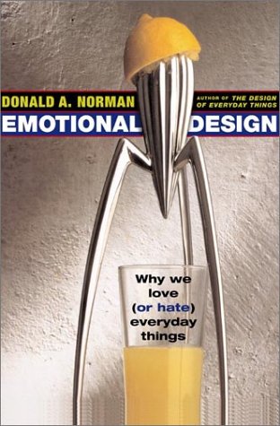
Emotional Design By Donald Norman


Title: Emotional Design: Why we love (or hate) everyday things.

Author: Donald Norman

Summary: The book begins, as the last one did, with a few examples of things that Dr. Norman likes around his house, either for their aesthetic value, sentimental value, or practical value. For example, he has a practical teapot, a teapot that would burn your hand if you attempted to pour hot tea from it (called the masochist's teapot), and a teapot that is very pretty but not very practical. He then goes into describing the different aspects of products that exist in our everyday lives cause us to either love them, hate them, or be indifferent to them. For instance, many people love Apple products because they spend more time working on the aesthetic design of the product than say, HP or Dell would. While Apple may not have as large a market share, as say, Microsoft, they have an extremely loyal customer base. In comparison to Microsoft, who has a very large customer base, but without much loyalty, because users get frustrated with their products or find them boring or unpleasing to work with.

He stresses several different factors that come in to play when a product is introduced to market, and its likelihood of success, as well as the different parts of the human thought process that judge a product. The first and most basic thought process is the visceral level, which consists of subconscious instinct and primal drive, such as eating or breathing or being aware of your surroundings. The next level is the behavioral level, which determines the way you go about your daily tasks, such as brushing your teeth or tying your shoes. The next and highest level is the Reflective level, where in depth thinking occurs, and humans are able to contemplate the meanings of things at much higher levels, such as thinking about whether the routine you follow when you drive to work everyday is really the most efficient, or if it could be improved upon.

Shaun's Opinion: As usual with his books, he spends a great deal of time elaborating needlessly over some moderately difficult concepts. He uses a great deal of examples, which is quite helpful, and most of his concepts make a lot of sense and I believe have a lot of real-world value, however he isn't very concise in getting his point across. Basically, the level to which he writes over and over again about the same concept (or maybe slightly changed) is enough to make a person get bored halfway through the book. While I still think this is a great read for anyone who is going to design software or any kind of products, it could definitely be a lot more plainly-put.

Thursday, February 18, 2010

"Pimp My Roomba"


Title: "Pimp My Roomba": designing for personalization

Author(s): JaYoung Sung, Rebecca E. Grinter and Henrik I. Christensen

Summary: The authors of this article did a study on the use of Roombas that were given to 30 people for 6 months, and they did some sub research on the concept of robot personalization while they were at it. Out of the 30 participants in the entire study, the only gave 15 a personalization toolkit, which included stickers (both basic and some not so basic) and letters and other things that they could attach to their robot, in addition to a couple of coupons that could be used to purchase a skin for their Roomba online. They frequently checked in with participants to see who would personalize their Roombas, and with what, and what effect it had on their experience with the product. It turned out that only 6 of the people who received a personalization toolkit took the time to actually apply stickers or letters, or personalize it at all. However, compared to the 15 that did not receive the toolkit, that is quite a large number, because none of those participants decided to personalize theirs. The effect of the personalization on those who did it was that they felt closer to their product, were more apt to keep it out instead of hidden, and more apt to use it.

Shaun's Opinion: I think this research is a good example of how manufacturer's can potentially benefit from making their products more customizable, either ordering it personalized, or adding a toolkit, like the author did. The benefit is that customers become more attached to their product, and potentially the brand name, making possible revenue from repeat customers a greater possibility. It is also interesting to see the kind of words used to describe the roomba after it has been personalized (like "part of the family", etc). People really view their personalizations as turning their roomba into a person, or maybe a dog.

CHI 2009: Movable cameras


Title: Movable cameras enhance social telepresence in media spaces

Authors: Hideyuki Nakanishi, Yuki Murakami, Kei Kato

Summary: The authors of this article attempted to show the effects that movable cameras might have in the teleconferencing world, and how distance to the person from the camera (of the person you might be talking to through a remote media session) effects how "realistic" the connection feels, and whether or not you feel like you are in the same room as the person. The authors often use the term motion parallax, I believe, to describe this effect. The authors basically set up an experiment where they would take students or other people on virtual "tours" through their robot lab, where they would have the presenter, or tour guide (who is also the experimenter), sit in a room in front of a tv with a camera, and continually cycle through 5 or so robots until the end of the tour, or experiment, was reached. The unknowing test subject would be guided through this "tour" of sorts, also sitting, or standing at different ranges, in front of a tv with a camera. After the experiment ended, the test subject would be asked to fill out a couple of questionnaires, telling the experimenters how real the experience felt, and if the changing distance from the presenter to the camera had any effect on the realism of the tour.

Shaun's opinion: I found this paper to be excruciatingly difficult to read, because the authors take a liberty in assuming the reader knows exactly what a motion parallax is, or what a media space is. They take no time to explain all the different terms that they use, leaving people ignorant of their field of work (like me) lost in the dark. After reading for a while I got the general sense of what they were talking about, but it is not reader friendly at all. Past this, however, the idea itself is interesting. Having a movable camera in a room, attached to a rod jutting out from the tv seems a bit impractical to me, but the implications that can be drawn from the experience it creates are interesting. If you approach a tv that contains the image of someone in a remote location that you are talking to, and the camera moves closer to the person, does it feel more realistic, like YOU are actually moving towards the presenter in the remote location? Most of the people who participated in the study said yes.

Tuesday, February 16, 2010

Part 1 "The Inmates are Running the Asylum"


Title: The Inmates are Running the Asylum

Author: Alan Cooper

Summary: For the first 7 chapters of the book, the author attempts to describe to the reader just what is wrong with most software that exists today. He gives us examples of how frustrating current software can be, and the reasons why software seems to follow a different production trend that does, say, construction. The author also describes the different types of people that use software, mainly discussing "the apologist" and "the survivor." The "apologist" in the context of the book is someone who enjoys using software despite the problems with interacting with it, due to the raw power that a piece of software might have. The "apologist" tends to accept poor software layout and frustrating design, and even boast about a piece of software, because of the potential power that it has, no matter how hard it is to use. The "survivor" in the context of the book is someone who is forced to use software, because of their job or another reason, but realizes how frustrating the software is to use, or blames the complicatedness of their interactions with the software on their own stupidity. The author also goes into detail describing current software implementation processes, and the main problem with it: No one thinks to design the software before implementing it in code. The author explains that software companies usually consist of businessmen and software engineers, who create a product that they would want to use, not necessarily what their customers want to use. They give no thought to hiring outside designers in order to facilitate their goals of increased sales due to user loyalty or pleasure with using their particular piece of software.

Near the end of the seventh chapter, the author begins to describe how programmers are different from most other human beings in the way that they view complexity. He says programmers tend to view complexity as a necessary obstacle in order to gain control, whereas the average human being would gladly relinquish control in order to avoid complexity. This attitude, the author says, gives the programmer "jock"-like qualities when it comes to the real world workplace, where mental creativity and strength are more highly valued, and where the programmer can truly take control again.

Shaun's Opinion: I thought that the first half of this book was a very interesting read, if a bit redundant. I can't really count how many times the author said something similar to "current software is implemented and not designed". I think most of what the author said is true of current software companies. The programmers tend to build programs around what is easiest to implement, not necessarily what is easy to use. And when their product fails, or gets beat out by the competition, they rarely give thought to poor design as the main cause, instead choosing to blame the lack of features, or some other irrelevant or potentially detrimental reason. I also thought the seventh chapter was humorous in that it felt like the author was attempting to establish dominance over the bullies in high school by elevating the programmer's mental capabilities to good height.

Sunday, February 7, 2010

UIST: Predicting Tie Strength With Social Media


Article: Predicting Tie Strength With Social Media

Authors: Eric Gilbert and Karrie Karahalios

Summary: This article delves into the attempts by the scientific community to be able to evaluate "tie strength" (How close one user is to another, how much they trust someone) via certain variables that arise from interaction between the two users. With the rise in popularity of social networking, like LinkedIn or Facebook, the value of this research and its potential result, a predictive model for tie strength, has dramatically risen in recent years. The authors first describe the background of the "tie strength" concept, which originated in the 70s, and has only recently become more of a hot issue. The authors wrote the article in an attempt to gather some quantitative data about "tie strength" and perform a proof-of-concept, showing that the theory of "tie strength" is a relevant one to both individuals and businesses. In order to gather this data, they first identified a target social networking site, and they chose Facebook. They then combed through Facebook in order to identify certain variables that could be "potential indicators" of "tie strength". They found 74 of these variables, each within different categories of the "tie strength" concept, such as "Wall words exchanged", "Mutual friends", "Inbox message length", etc. They gathered data from these variables as well as from a questionnaire that was posed to 35 participants that were asked to participate in the research. The participants were given 30 minutes to answer the questions about as many facebook friends as possible. The authors then ran this data through their algorithm, and came up with results, both suprising and not suprising, about the predicted "tie strength" given by the algorithm, and the actual "tie strength" according to the participants. The study was able to come up with an 85% accuracy at determining "weak ties" (acquaintances, business associates) and "strong ties" (family, close friends).

Shaun's Opinion: The research done in this field by these two authors is pretty interesting. While I don't see much value in this research for me personally, I can see how it would potentially be useful to politicians, who want to get a message out to people of similar background, experiences, and viewpoints. I think the most interesting part of this whole study is the fact that the authors were able to identify 74 potential "tie strength" indicators, just in facebook alone. That is quite a staggering number to identify, I think if the task were given to me I could've come up with 10 or so.

UIST: "My Dating Site Thinks I'm a loser"


Article: “My Dating Site Thinks I’m a Loser”:
Effects of Personal Photos and Presentation Intervals
on Perceptions of Recommender Systems

Authors: Shailendra Rao, Tom Hurlbutt, Clifford Nass, Nundu JanakiRam

Summary: The authors of this article decided it would be interesting to study the problem of people "gaming" social networking sites in order to procure better responses from the algorithm that the website uses in order to match them up with other people, in this article it is specifically dating sites that get targeted. The authors created a website, devoid of everything except for a questionnaire, that would be used to gather information from participants in the study (56 people, avg age 20.2). However, the responses that the website provided were not at all dependent on the answers to the questionnaire that the participant provided. The goal was to study the different website features that would have an effect on whether or not a person would feel it necessary to "game the system" (change their responses to the questionnaire) in order to gain a better response from the algorithm's matched results. What the authors discovered was mainly that a small element, such as the user's personal profile picture being displayed while the questionnaire was being taken, had a large effect on whether or not the user would take to "gaming the system". If a user had a profile picture present while answering the questionnaire, they would be far more likely to refrain from "gaming the system".

Shaun's Opinion: A very interesting look into the human psyche, I think. While there was a LOT of statistical information provided here, which made the article very hard to follow unless you have a degree in statistical analysis, the end result was nonetheless very interesting. To be able to quantitatively measure the probability that a person would lie about themselves in order to gain better results from a dating website is very fascinating. I suppose looking at your own profile picture, or simply having it displayed while answering a questionnaire, gives people a chance to look at themselves before they decide to lie, and most people chose not to after being able to see their own picture.

UIST: Speech and Dialed Input in India


Article: A Comparative Study of Speech and Dialed Input Voice
Interfaces in Rural India

Authors: Neil Patel, Sheetal Agarwal, Nitendra Rajput, Amit Nanavati, Paresh Dave, Tapan S. Parikh

Summary: The authors of this article took it upon themselves to test out two different interfaces for providing agricultural information to remote farmers in India, most of whom were illiterate and had never used a PC before. The two different interfaces that would be used to provide agricultural information to the farmers were both phone systems, but one used speech recognition in order to navigate through a menu, and the other used dial tones. They took a mobile phone and a dialpad to several homes of the farmers who were to evaluate the phone systems, and took measurements of error rates, facial expressions that would indicate frustration, etc, and took a post-use questionnaire in order to gauge user enjoyment of the system.

Shaun's Opinion: The first thing that struck me about this article is how it is very confusing, right from the get go, until you stop and think about what they are saying. The authors provide very little background on the work they are doing, and don't even delve into the meanings of most of the acronyms they use. However, I do applaud their work for trying to find the most cost effective and easiest to use (especially among a less educated user base).

Thursday, February 4, 2010

Robots and Magic Cards


Article: Magic Cards: A Paper Tag Interface for Implicit Robot Control

Author(s): Shengdong Zhao, Koichi Nakamura, Kentaro Ishii, Takeo Igarashi

Summary: To begin this article, the authors describe the fast moving progress of robots out of science fiction into the real world, and provide examples of robots that are already popular in society, such as the Roomba and the Scooba, which are two robots used to clean surfaces. The authors also describe various stories and folktales that talk of gnomes or magical beings doing tedious chores for them, like housework, while they are asleep or away from home. The authors then describe an idea they have come up with to abstract away the layer of complexity that exists when users are forced into interacting with robots in order to instruct them to perform tasks. The idea is to remove the person instructing the robot via button inputs and move it to a "Magic Card" system. The Magic Card system works by having various types of cards used that can be placed in areas or on objects, that instruct robots to do various things at various times, or to avoid certain objects while accomplishing other tasks. The user, which in this case is a typical male or female doing housework, would place a card such as "clean this room" and "at noon" in order to tell the cleaning robot to clean a certain area at noon. These cards could eventually be memorized in a certain order to allow repeated tasks to become simplified. However, due to the current state of robotics, the article mainly only dives into cards that can be read on the ground, and performed with robots that are currently capable of doing ground-level chores, like vacuuming. The authors did a study in which they paid participants to give them feedback on their system, finding that there was very little confusion with the cards, and almost all of the participants were excited about the idea of the simplicity of having robots do chores while they were away simply with cards.

Shaun's Opinion: Kudos to the authors for their very creative method of abstracting the layer of complexity of robotics away from the end user, especially the elderly or disabled. This idea could save quite a bit of time for most people, if they were able to get things done while away simply by purchasing some robots. The card system is a very good one, with simplified tasks in an easy human readable form such as "clean this room at noon". However, the tag system itself seems to create a bit of tediousness in its implementation. In order to perform a task, the human user must create all of the tags and place them in the appropriate spots. For instance, the authors describe a system where the users could place tags on objects they wanted to be moved to a single location. The system, in this case, requires the user to go to each one of the items and "tag it" to be picked up, when the user could probably have just done it themselves in the same amount of time. Not to mention leaving these tags all over the place in your home seems to create a mess of its own. However, the possibilities that arise from an idea such as this have great commercial potential, especially if the interaction between users and robots could be simplified to make it available to a wide range of people, technical-savvy or not.

Tuesday, February 2, 2010

Book Review: The Design of Everyday Things by Donald A. Norman


Summary: The book "The Design of Everyday Things" by Donald A. Norman attempts to explain some of the problems that consumers, well just people in general, have with the products they use on an everyday or a not-so-everyday basis. The book describes (with the help of several real world stories) frustrations that people have with items they find around their home that are used everyday (Ex. Light switches, oven burner controls), items outside the home that are frequently used (Ex. their car), or items found at work (Ex. their work telephone, or computer). The book also describes frustrations with items that are found everywhere, like doors. After initially describing a lot of the issues that people have with these items (along with some hilarious or disastrous consequences), the book attempts to break down the mental functions that most normal human beings use to interact with these items, like memory, visual signals, or auditory signals. The book also goes into detail some of the behaviors, external or internal, that contribute to certain design decisions, whether it be good or bad. The author describes the difficulties that are encountered by designers, whether it be from figures of authority, third party interests, or flaws with the design process that are initiated, perhaps unknowingly, by the designer themselves.

Shaun's Opinion: While I thought this book was a tad lengthy, and perhaps a bit too wordy, it does a great job of pointing out the "obvious" factors that influence human interaction with products and the thoughts that may be occuring in the designers of the products themselves. The author frequently mentions considerations that must be taken during design that would seem obvious to most people, but over time some of these considerations have been lost to other outside influences, such as cost or aesthetics. Some of the stories in this article were pretty funny, such as the man with a degree in engineering who can't operate his own laundry machines. There were also a few that were eye opening, such as the many descriptions of the airline accidents that occured due to poor design. The author, to his credit, is very thorough and exhaustive of all the issues surrounding product design, but it also comes at a price. I felt like the author was being far too wordy for simple issues that he was trying to convey, or that he would frequently refer to other design flaws while explaining another, and that it was distracting. There is a lot of information that he covers, and it seems a bit chaotic at times during the book.

Ethnography Idea

I will be working with John Farst on his ethnography idea, which is posted here:

JD's idea

Monday, January 25, 2010

UIST 2009: A Practical Pressure Sensitive Computer Keyboard


Article : A Practical Pressure Sensitive Computer Keyboard

Authors: Paul H. Dietz, Benjamin Eidelson, Jonathan Westhues and Steven Bathiche

Summary: In this article, the authors talk about a new modified design they have for a computer keyboard that would cause it to have pressure-sensing capabilities. To begin with, they describe how the current computer keyboard hasn't really evolved much from the original versions that were being used 20 years ago, at least from a superficial glance, even with the abundance of newer technologies available. They attribute this lack of progress to the high cost of training a user to use a new device. Their goal from the beginning is to make the new keyboard as intuitive as possible, and in order to achieve this, they make 0 modifications to the physical feel or look of the keyboard, and instead opt to add pressure sensing technology at the point of contact for each key.

In order to accomplish pressure sensitivity, they use a special variable resistance material that increases or decreases in resistance depending on how hard the user is pressing on it. They insert this material in between the contacts of each key, and place it in such a way that the pressure sensitive technology is only activated after a normal key stroke is accomplished. They use a set of rows and columns, each hooked up to an op amp, in order to measure differences in voltage to determine which key is being pressed, etc.

The authors then go on to describe a few instances in which this technology could be used, such as emotional instant messaging, video gaming, etc.

By adding the technology to an existing keyboard, they added a fairly modest amount of new abilities to the keyboard while only altering its design minimally.

Shaun's Opinion: I think this article right here is a great example of improving on existing technology without running into a whole bunch of new tricks or methods to learn. The keyboard works much the same as a regular keyboard, just with a few added features. There are no extensive training sessions, and the keyboard is only slightly more expensive to manufacture, using probably >90% of the current manufacturing processes. Articles like this make a person look around and think about objects or things in their lives that could probably be easily improved without too much effort.

Sunday, January 24, 2010

UIST 2009: PhotoelasticTouch


Article: PhotoelasticTouch: Transparent Rubbery TangibleInterface using an LCD and Photoelasticity

Authors: Toshiki Sato, Haruko Mamiya, Hideki Koike, Kentaro Fukuchi

Summary: In this article, the authors present a new idea for a multitouch interface that is capable of a few more means of user interactions than some its competitors. Dubbed "PhotoelasticTouch" by the creators, the new system uses a high speed camera mounted on top of a desk-like device with an LCD panel built into the desk. The camera is mounted directly above the LCD in order to take a top-down picture of the activity occuring on the screen below. The interface uses a couple quarterwave plates and a Hyper-Gel sheet in order to create certain deformities of light that can be detected by the camera above, which uses a polarized lens filter in order to filter the light coming from the LCD, unless the light is caused by a deformity in the Hyper-Gel.

After the user presses on a piece of the hypergel, a deformity is caused which creates a spot of light on the LCD screen below that the camera placed above, detects. The image captured by the camera is then analyzed by the software, which uses a special algorithm to detect the size of light deformities caused in the material in order to judge the amount of force being applied to the touch screen, and from where it originated, the direction it is headed, etc. The authors then go on to describe certain applications to which the new interface is particularly suited, such as a paint application, a pressure sensitive touch panel, and a tangible face.

Shaun's Opinion: In my opinion, the idea proposed by these folks is very unique and potentially useful. However, the current way that it is setup (camera overhead that captures light deformations in the material below) seems to have some inherent flaws. If the user decides to hang their head or part of their body over the same part they are touch, no light deformations will be detected and thus nothing will happen. Not to mention the inherent impracticality of an overhead type system. This system, while unique and appealing, and certainly useful in some applications, would probably never become mainstream simply due to the bulk and size of the equipment needed to make it work properly.

Tuesday, January 19, 2010

UIST 2009: Reconfigurable Ferromagnetic Input Device


Summary - The article "A Reconfigurable Ferromagnetic Input Device" is about the possibilities of a new sensory device that they have discovered in their research. The authors describe the multiple new applications that could be used if the device was enhanced, such as reconfigurable input devices that could be made on-the-fly by the user and then interpreted easily by the magnetic sensing device they have come up with.

The device uses magnetic coils attached to circuitry in order to detect changes in the magnetic fields produced by the coils that are caused by the presence of ferromagnetic objects being placed on top of the device. The changes in magnetic field caused by the object create a voltage increase at the sensory input, which is then amplified and analyzed by a C# library, and then visualized by the same library.

So far, the device can only visualize objects in 2-D, but research could be done, they say, to allow it to sense in 3-D.

Shaun's Opinion - While the idea of this device is certainly appealing, at the moment its design constraints make it hard to imagine much real world usefulness. The sensing device requires the input devices to be ferromagnetic, and it only currently sees objects in 2D. While it certainly does a fine job of detecting the touch on a ferromagnetic bladder, I don't see it being very practical. This idea definitely needs more research to possibly become a useful, implementable idea.

UIST 2009: Ripples


Summary - The "Ripples: utilizing per-contact visualizations to improve user interactions with touch displays" focuses on the problem of user frustration and user lack of confidence inherent in most single touch and multi-touch displays, and the solution that the authors have come up with, a visualization system titled Ripples. The two main problems discussed in the article are:


Fat Finger Problem - Essentially this is when you touch a touchscreen and your finger covers a larger area than what the "touch" signal is actually reduced down to, causing a "miss".


Feedback Ambiguity Problem - The feedback ambiguity problem is when a user touches a touchscreen and does not achieve the desired result, and the system provides no feedback or cues as to what might have happened. For example, when you think you've touched a button, but you actually missed it (according to the system) and there is no feedback provided as to what happened, so you begin to lose confidence that the button actually works, or perhaps that the system is laggy.

The authors then go on to describe the system they implemented to help user's learn how to solve these two problems, which is, simply put, to places ripples and other visual cues at contact points on the screen when it is touched. The ripples run on top of whatever application is running in the background, so they can remain consistent and application-independent.

Shaun's Opinion - I think what is presented in this article is a very clear-cut, simple solution to problems with touch screens that I personally have experienced. Having a computer engineering background helps me to grasp the source of erroneous touch inputs easier than the average user, and I even find myself frustrated with touch screens. I think the ripples effect on touch screens would have quite a large impact on user confidence in touch screen applications, allowing them to visualize what the system is seeing, as opposed to what the user thought they did. All in all, I think this system would allow users to learn from their mistakes and be able to make better use of touch screen applications.